Are your favorite food logos trying to tell you something?
14 Food Logos With Sneaky Hidden Messages
Nestle
Ever notice the bird’s nest in the logo on some Nestle products? Henri Nestle, the brand’s founder, incorporated this part of his family’s coat of arms into the logo when he started the company.
Duncan Hines
This logo’s hidden meaning can easily be missed! If you look closely at the Duncan Hines logo, you can see that the white part looks almost like the bottom half of a book—and that’s intentional. Duncan Hines was a real person who started his career as a traveling salesman. He wrote a book detailing the best restaurants he’d visited across the country while off on business. The logo is a tribute to the company’s founder.
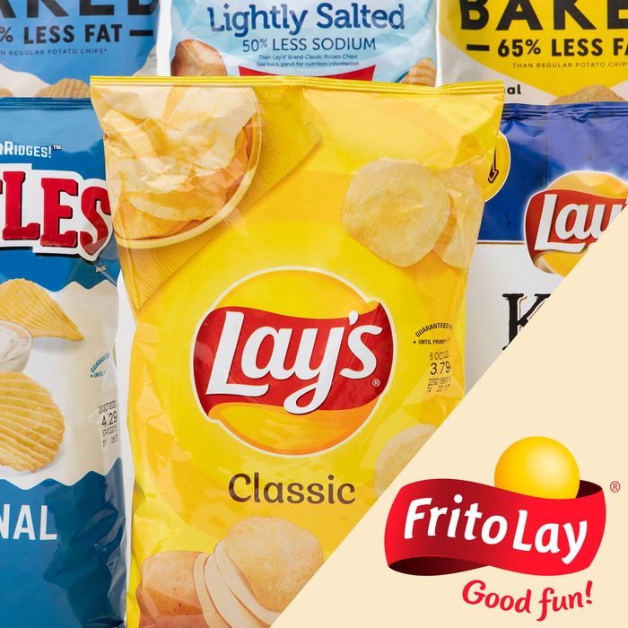
Lay’s
Here are two logos with hidden meanings. The Lay’s logo looks a lot like the logo of its parent company, Frito-Lay. The company’s website says, “from summer barbecues to family gatherings to time spent relaxing at the end of a long day, Frito-Lay snacks are part of some of life’s most memorable moments.”
From this perspective, the sun logo makes sense—we definitely associate potato chips with summer and sunny days! And when it comes to the definitive ranking of Lay’s potato chips, the best flavor under the sun is maybe the most surprising.
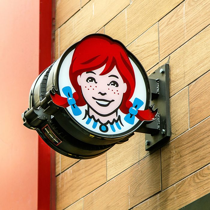
Wendy’s
Wendy’s fast food chain was named after founder Dave Thomas’ daughter. She also appears in the company’s friendly logo, but there’s one more family member hidden in the picture. Take a closer look at the redhead’s ruffled collar, and you’ll see the word “mom.”
Don’t forget to try out our copycat Wendy’s recipes.
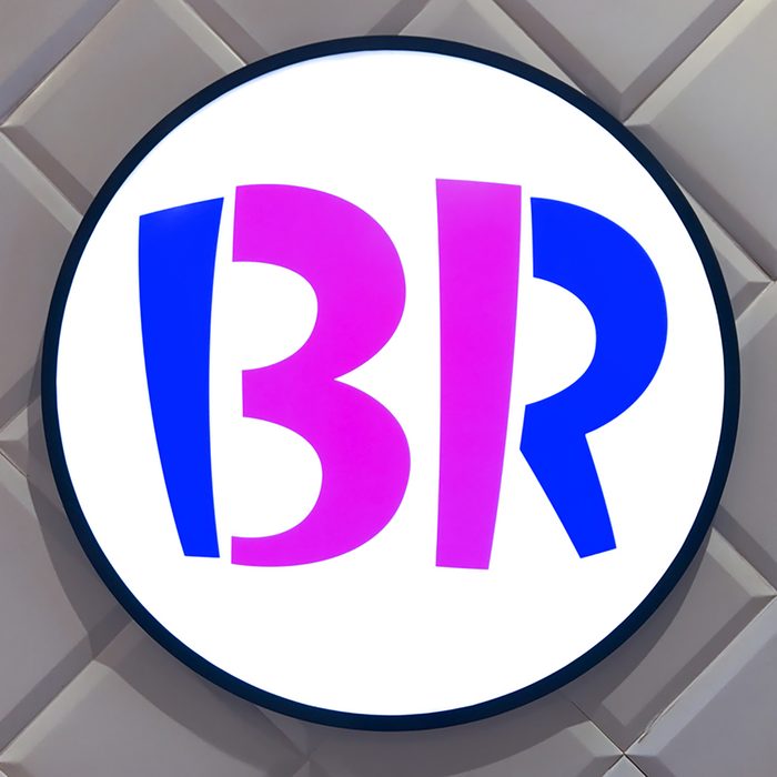
Baskin Robbins
If you didn’t already know that Baskin Robbins offered 31 flavors when it first opened, the logo offers you a clue. The magic number is hidden in the curve of the “B” and the stem of the “R.” Pick up one (or two) of their current flavors to make a cool ice cream dessert.

Toblerone
The Toblerone candy company was started in Bern, Switzerland, a city famously associated with bears. According to legend, the city of Bern owes its name to a furry hibernator. When you look closely, you might see a little something bruin in the company’s mountain logo.
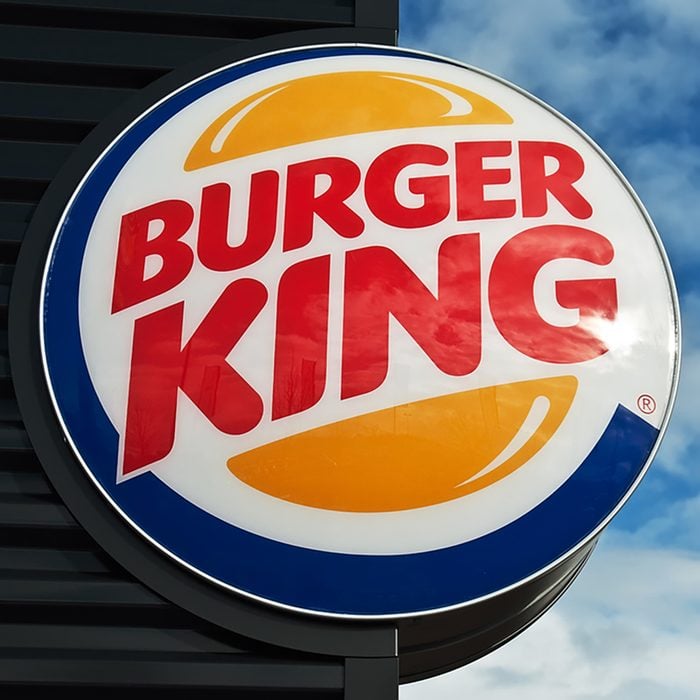
Burger King
The Burger King logo gets right to the point! The words “Burger” and “King” are two juicy hamburgers nestled between two buns. If the logo has your mouth watering, head to the drive-thru and order something from the restaurant’s secret menu.
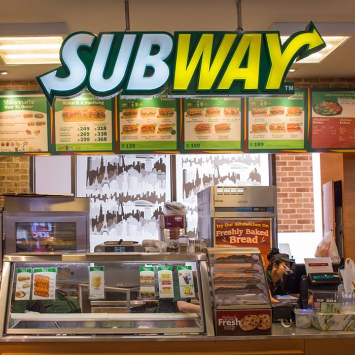
Subway
The Subway logo does its pointing with two hidden arrows. The first letter and the last letter of the name symbolize the entrance and exit of—you guessed it—a subway. That’s one clever way to design a hidden meaning in a logo if we do say so ourselves.
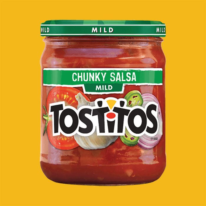
Tostitos
You won’t believe you didn’t notice this logo with a hidden meaning before. The two T’s in the center of the logo on Tostitos chips, salsas and dips are two people munching on chips. The “I” between them is a bowl of salsa at a table. Awesome!
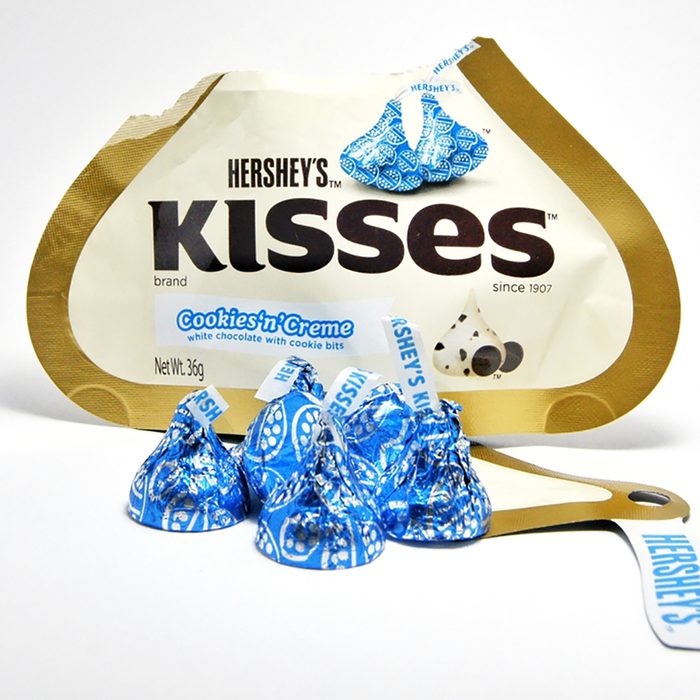
Hershey’s Kisses
The logo on every Hershey’s Kisses package gives a little bit of love to everybody who buys a bag. An extra kiss is cleverly tucked in between the “K” and the “I.” You have to tilt your head to the left a little to get it—just like for a real smooch.
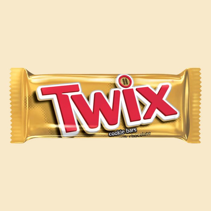
Twix
In the dot of the “I” in the Twix logo, there are two tiny Twix bars to subtly highlight the company’s left Twix/right Twix campaign.
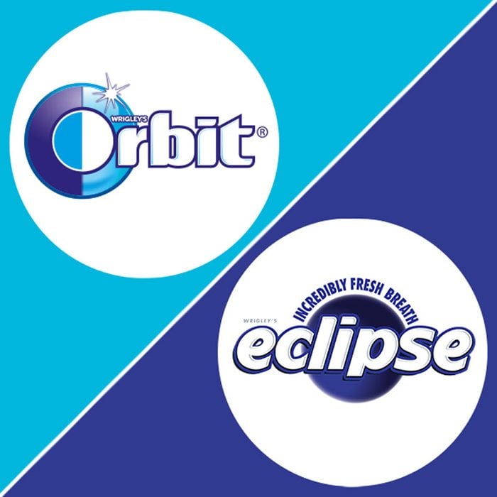
Orbit and Eclipse
You don’t need to be a rocket scientist to chew gum, but you’ll have to do some research to decipher these logos. In the Orbit logo, the “O” is half dark and half light to symbolize the day and night of the Earth’s orbit. Look closely and you’ll see a solar eclipse hidden in the Eclipse logo.
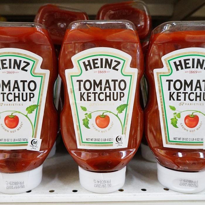
Heinz
Every bottle of Heinz ketchup highlights the company’s “57 Varieties”—but the number 57 doesn’t have much to do with the number of products the company makes. Founder Henry John Heinz’s lucky number was five, and his wife’s lucky number was seven. That adds up!
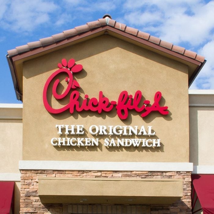
Chick-fil-A
Chick-fil-A has a couple of secrets: There’s a reason for its ridiculously good chicken sandwiches, and, of course, it has a secret menu of great food. The message in this logo isn’t exactly hidden, but the chicken in the “C” makes it clear what the chain’s focus is.


